Below are screen shots of each embedded banking component and features that are shared between the components. The screen shots are labeled with the parameter that adjusts that feature. For a full explanation of each parameter, see the Component Customization page.
Some features of embedded banking components contain additional explanatory notes, such as when a feature of a component can be completely disabled.
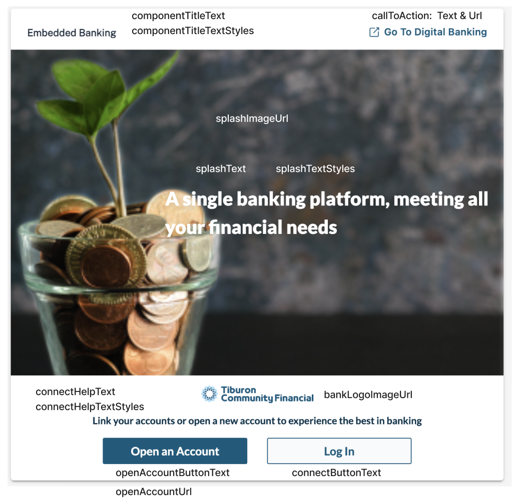
Unauthenticated Screen
The unauthenticated screen is the screen the user would see before they have authenticated with the FI.
If multiple components are available on a page, only one component would show the full unauthenticated screen with the calls to action (like the log in button). The other components would not have the calls to actions available.
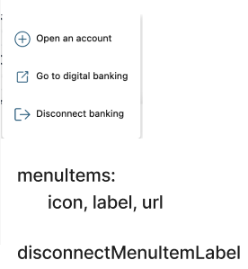
Context Menu(s)
All components include a Context Menu with links to various banking activities that cannot be done within the component, and a link to disconnect from embedded banking. These menus are highly customizable and do not need to contain the same links as examples may show.
There may also be other menus within a component. The Context Menu is always indicated by the three vertical dots icon.
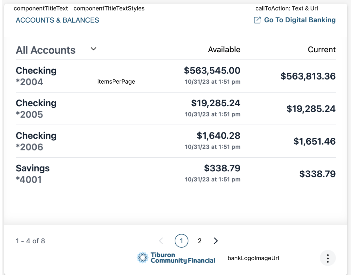
Accounts and Balances Component
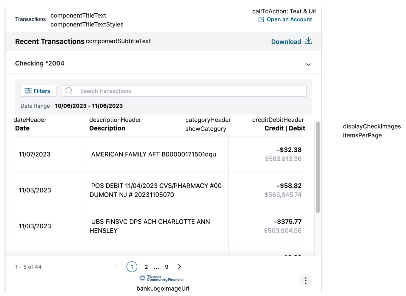
Transactions Component
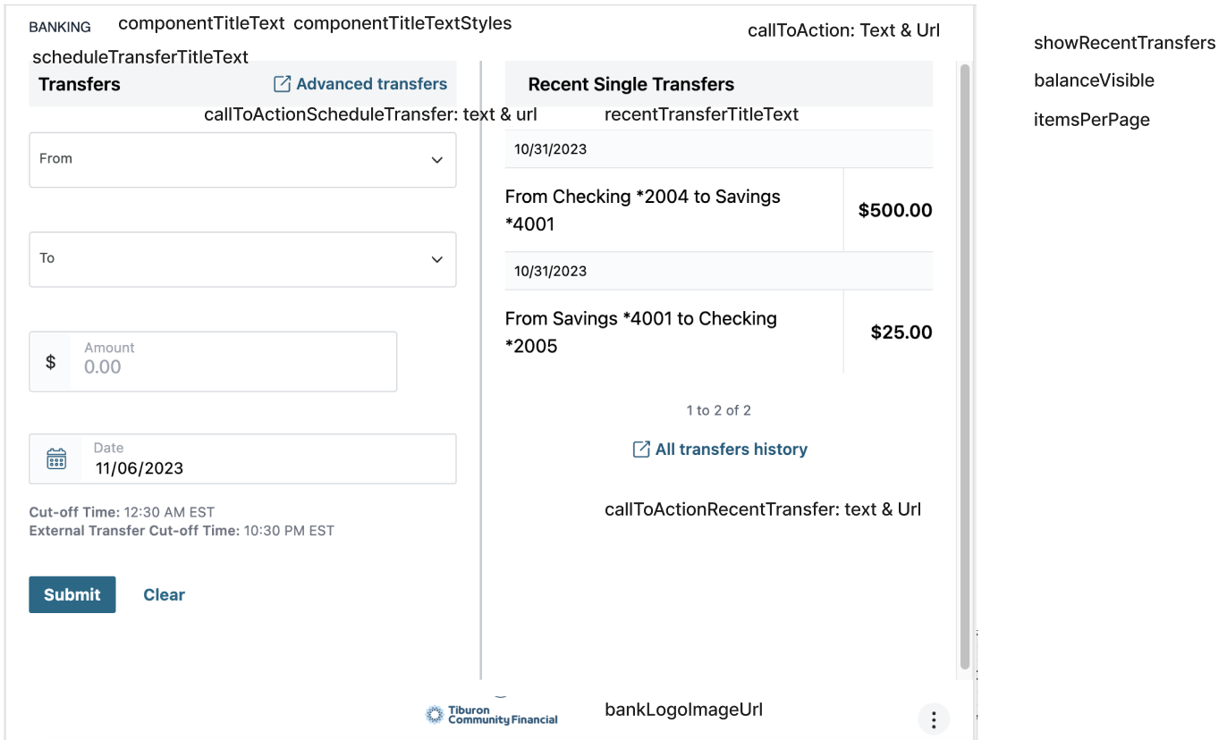
Transfers Component
The Transfers component can have the Recent Single Transfers panel completely hidden via the showRecentTransfers option. Everything to the right of the center line would not be shown and the component would be about half of the full width.
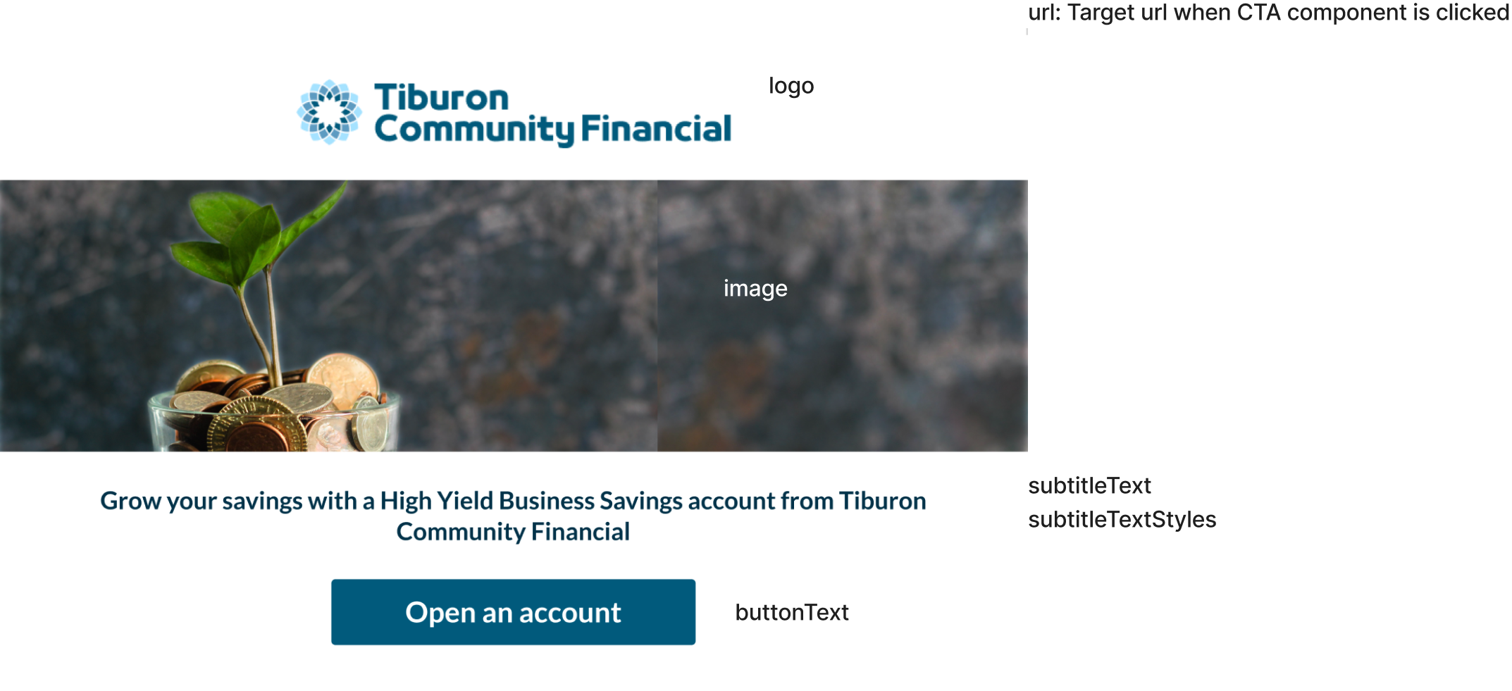
Call to Action Component
Up to 20 versions of the Call to Action component can be created. When displaying the component, the selectedItemName parameter is used to select the name of the specific version to show.